



Dark Mode Isn't a Feature, It's a Decision
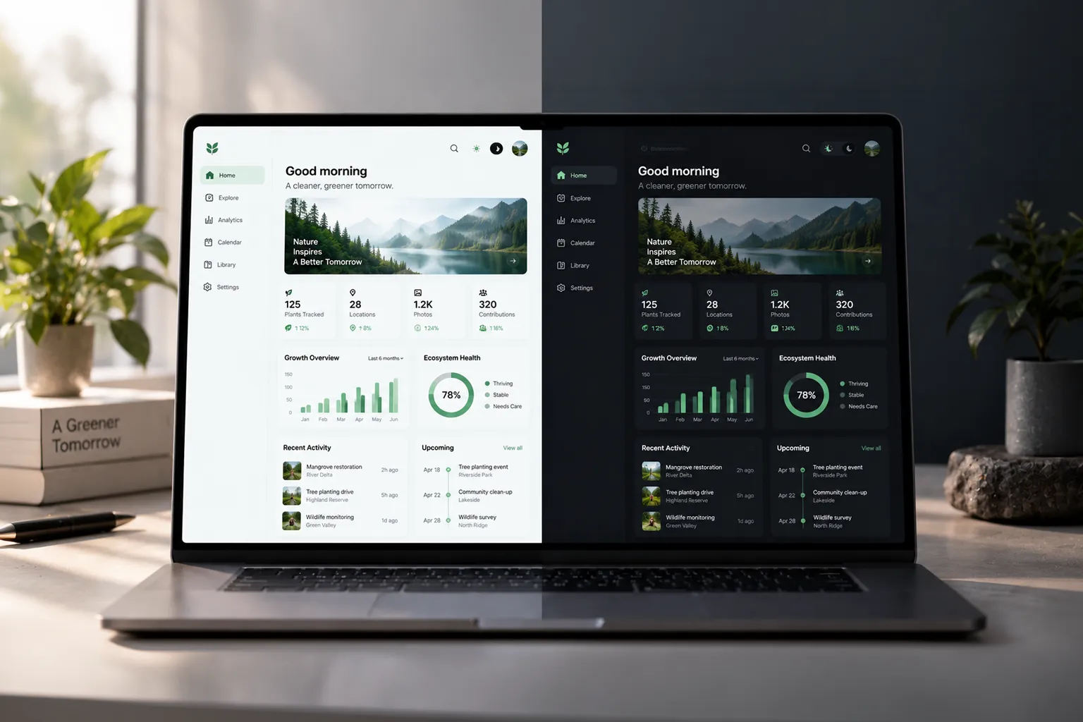
Almost every client asks for it. Almost none of them ask why. "Can we get a dark mode toggle?" is one of the most common requests we hear — and one of the least examined.
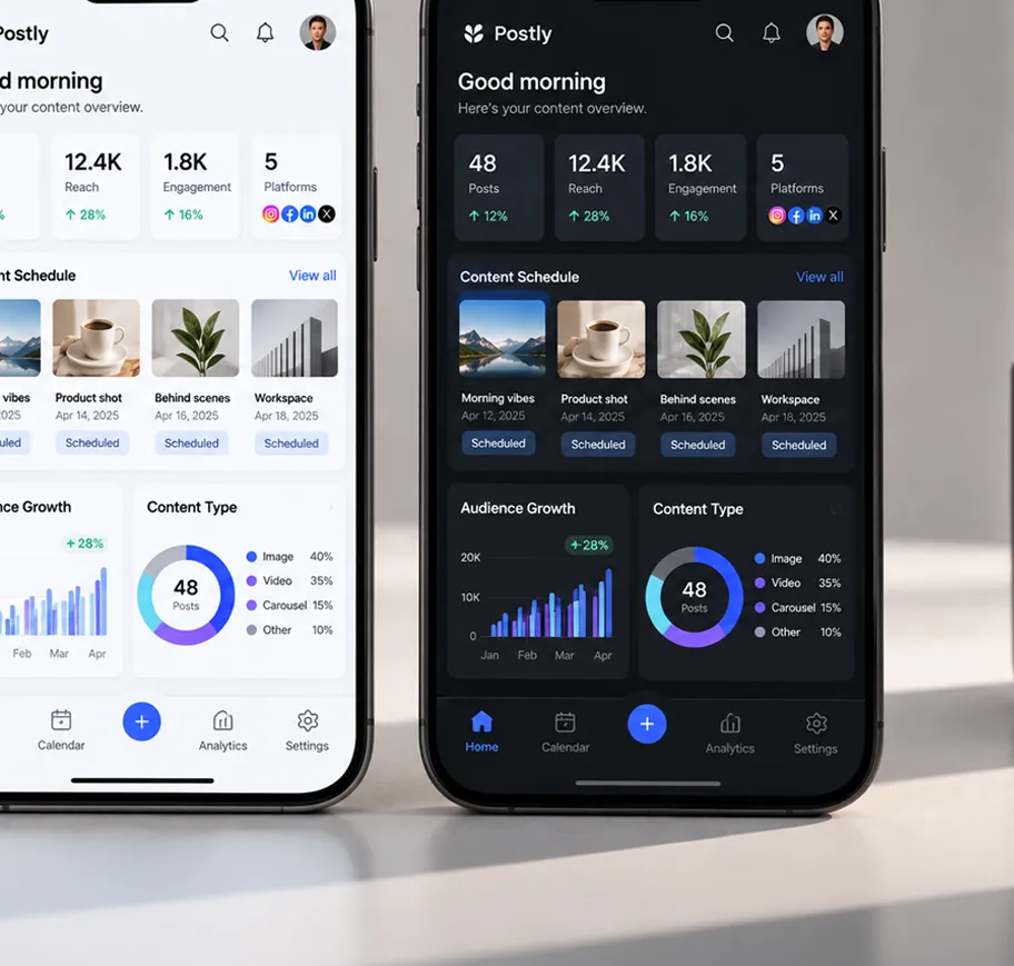
Dark mode is easy to want and easy to demo. A screen turns black, the text turns white, and it looks modern in a pitch deck. What's harder to see in that demo is everything dark mode quietly commits you to the moment you ship it — a second design system you now have to design, test, and maintain for as long as the product exists.
/ Table of contents:
The Dark Mode Reflex
Most dark mode requests don't start from a user complaint. They start from a competitor's screenshot, a system setting, or a general sense that every serious app has one now. That's not a bad instinct — dark mode has become a real user expectation in some categories — but "everyone has it" is a trend observation, not a design brief. It doesn't tell you when it helps, or whether it helps your product specifically.
What Dark Mode Actually Solves
Stripped of the hype, dark mode solves a short, specific list of real problems: reduced eye strain in low-light environments, less glare during long night-time sessions, meaningful battery savings on OLED screens, and a genuine aesthetic preference for content-heavy or immersive interfaces like video, code, or reading apps. Where any of those apply to how your product is actually used, dark mode is doing real work.
What It Quietly Breaks
What rarely makes it into the pitch is the cost on the other side. Contrast ratios that passed accessibility checks in light mode can fail in dark mode. Brand colors that were built for a white background can look muddy or overpowering on black. Illustrations, icons, and photography shot for one background often need a second version. Shadow and elevation systems — the whole visual language of "this sits above that" — frequently stop working once the base color flips. None of it is unsolvable. All of it is more design and QA work, permanently, not once.
Dark mode isn't a color inversion. It's a second design system you now have to maintain forever.
/ AUDDCONCEPT
Where It Actually Earns Its Place
Dark mode earns its keep fastest in products built around long, focused sessions — code editors, dashboards, video and photo tools, reading and note-taking apps — where people genuinely spend hours at a time, often in dim rooms or at night. The longer the session and the darker the environment, the stronger the case. A marketing site someone visits for ninety seconds in daylight is a much weaker candidate, no matter how many people ask for the toggle.
The Questions to Ask First
Before it goes on the roadmap, we run through the same short list with clients:
- When and where is this actually used? Long evening sessions are a different case than quick daytime visits.
- Is this solving a real complaint, or copying a trend? "Users asked for it" and "competitors have it" are not the same signal.
- Can the brand survive the inversion? Colors, imagery, and contrast all need to be checked, not assumed.
- Do you have the ongoing bandwidth? Every future screen now ships in two versions, not one.
Final Thoughts
Dark mode isn't wrong for your product — it's just not automatically
right for it, either. Treated as a checkbox, it's a fast way to double your design debt for a
feature most users will never toggle. Treated as a decision — backed by how the product is
actually used, not just what it's expected to have — it can be one of the more meaningful
usability improvements you ship all year.
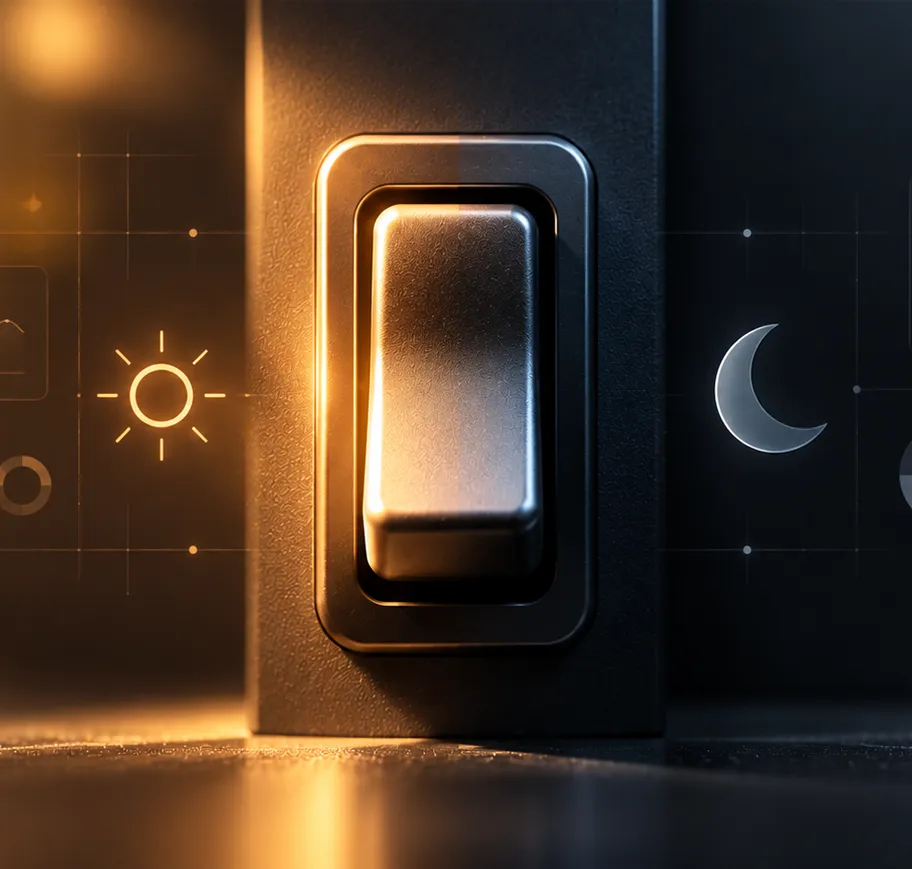
The toggle is easy. The decision behind it is
the part worth actually making.
What do you think?
Share your thoughts. Your email address will not be published.