





One Font, Two Weights, Zero Excuses: The Case for Typographic Restraint
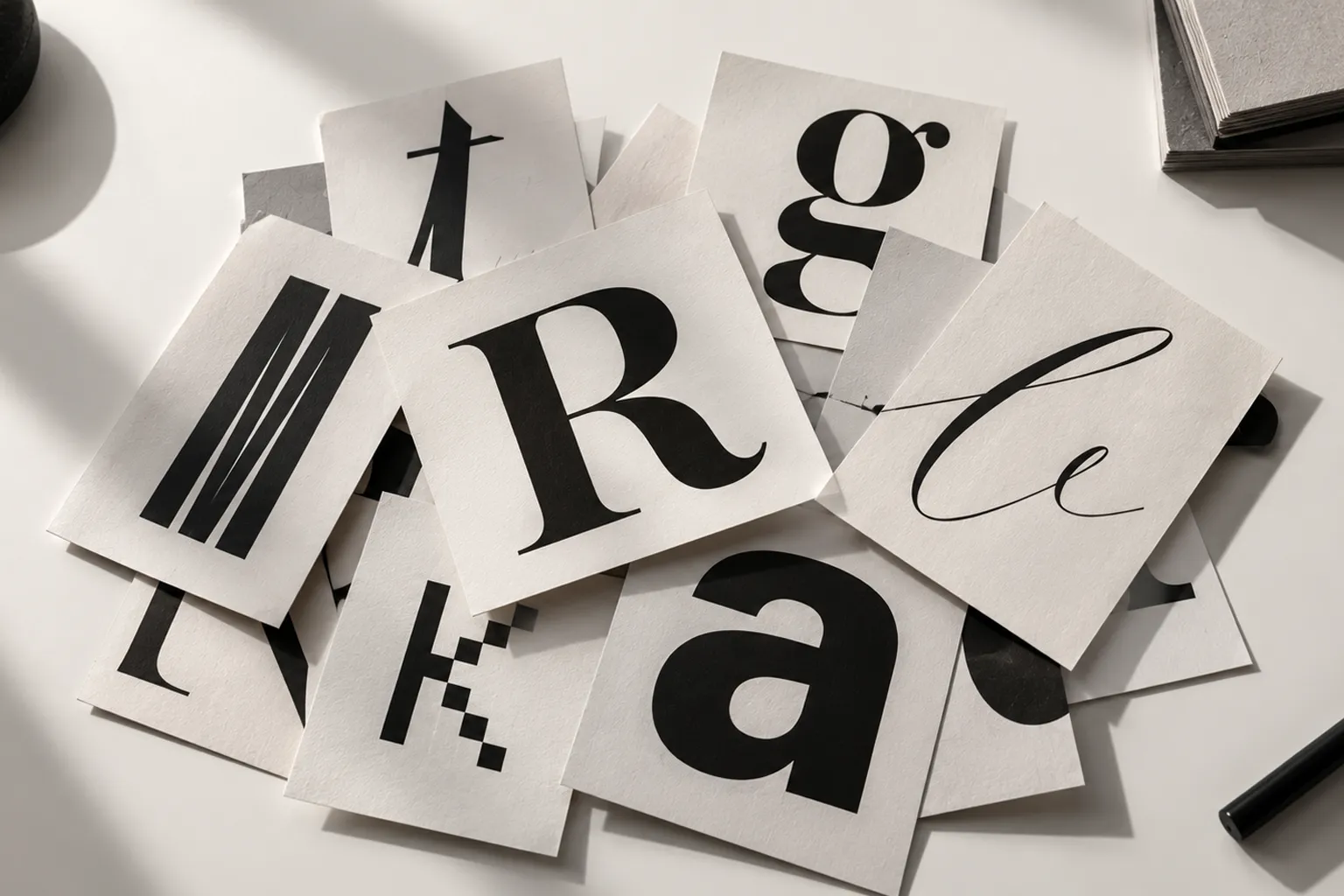
Open the brand guidelines of most small businesses and you'll often find four or five typefaces fighting for attention. A display font for the logo. A serif for the headlines. A clean sans-serif for body copy. A script for quotes. And, somewhere along the way, a monospace font for numbers, pricing, or "something technical."
Each decision may make sense on its own. Together, they can create something very different from what the designer intended. Instead of looking expressive, the brand starts looking uncertain. Instead of looking sophisticated, it starts looking busy. And instead of creating a recognizable voice, typography becomes a collection of unrelated voices.
Now look at many brands that feel exceptionally refined. Their systems are often surprisingly simple: one type family, two weights, a carefully controlled scale, consistent spacing. That's it.
This isn't necessarily a budget decision. It is a discipline. Typographic restraint is one of the simplest ways to make a visual identity feel intentional. And perhaps more importantly, it forces the designer to solve design problems with design — not by adding another font.
/ Table of contents:
- The Font Drawer Problem
- Why More Fonts Rarely Create More Personality
- Why Restraint Reads as Confidence
- The Two-Weight System
- Hierarchy Without Adding Fonts
- Where the Extra Fonts Actually Go
- Typography as a Design System
- The Operational Cost of Too Many Fonts
- Building It in Practice
- When One Font Isn't Enough
- The Final Rule
The Font Drawer Problem
It usually starts innocently. A designer is exploring directions for a new brand and begins collecting possibilities. One font feels elegant. Another feels modern. Another feels editorial. A fourth feels distinctive. Soon there is a display font for the logo, a serif for "elegance" in the headlines, a sans-serif for the body copy, a script for the occasional quote, and a monospace font someone added for a pricing table.
None of these choices is necessarily wrong. The problem appears when they are asked to coexist. Typography is not a collection of isolated decisions — typefaces interact with each other through:
- shape, weight, and x-height
- proportions and spacing
- rhythm and tone
- density and visual texture
Put enough different typefaces together and the viewer has to process all of those differences simultaneously. The result isn't necessarily richer. Often, it is simply louder.
The "one more font" cycle
The pattern is familiar. "The headline doesn't feel distinctive enough." Add a display font. "Now the body feels too plain." Add a serif. "The quote needs something special." Add a script. "The numbers need to feel technical." Add a monospace.
At some point, typography stops supporting the identity and starts becoming the identity. The designer is no longer building a system — they're collecting exceptions.
The font drawer is a symptom
The real problem isn't having multiple fonts. The real problem is using additional fonts to solve problems that could have been solved through hierarchy. A weak headline doesn't necessarily need another typeface. It might need:
- more scale or a stronger weight
- tighter tracking or better line-height
- more whitespace or a different alignment
- stronger contrast or a more confident layout
A design system becomes stronger when those variables are used intentionally.
Why More Fonts Rarely Create More Personality
There is a common assumption in branding: more visual variety equals more personality. It sounds logical. But typography doesn't work that way. Personality doesn't necessarily come from the number of visual ingredients — it often comes from how consistently those ingredients are used.
Consider a brand that uses one typeface everywhere. The typeface begins to become recognizable. Its proportions become familiar. Its rhythm becomes part of the brand. Its relationship with the logo, imagery, colors and whitespace becomes predictable. That predictability is valuable — it creates recognition.
Now imagine the same brand using five unrelated typefaces. Every new page introduces a new personality. The viewer has to recalibrate. The typography may be individually interesting, but the brand becomes harder to recognize as a single system.
Consistency creates memory
Think about visual identity as a language. A language becomes recognizable because certain structures repeat. Typography works in a similar way. If a brand consistently uses the same type family, the viewer begins to associate that typographic voice with the brand. The typeface doesn't need to shout — it simply needs to be consistent.
This is one reason restraint can feel premium. Luxury isn't always about adding more. Often, it is about removing everything that doesn't need to be there.
Why Restraint Reads as Confidence
A single typeface, used consistently, does something a font drawer never can: it gives the rest of the design room to speak. When typography stays constant, other variables become more important. Spacing becomes noticeable. Scale becomes meaningful. Color becomes more powerful. Images gain more attention. Layouts feel more deliberate. Even small changes in weight begin to communicate hierarchy.
This is where restraint becomes useful. You are no longer asking "Which font should I use here?" You're asking "What does this piece of information need to do?" That is a much better design question.
The paradox of simplicity
The simpler the typographic system becomes, the more precise the designer has to be. If you have five fonts, you can create contrast simply by switching fonts. If you have one font, you have to create contrast through:
- scale, weight, and spacing
- position and alignment
- color and whitespace
- composition
The constraint forces better decisions. That's why typographic restraint isn't about making a design boring. It is about making every decision matter.
Variety isn't what makes type feel rich. Consistency is — variety just makes it feel busy.
/ AUDDCONCEPT
The Two-Weight System
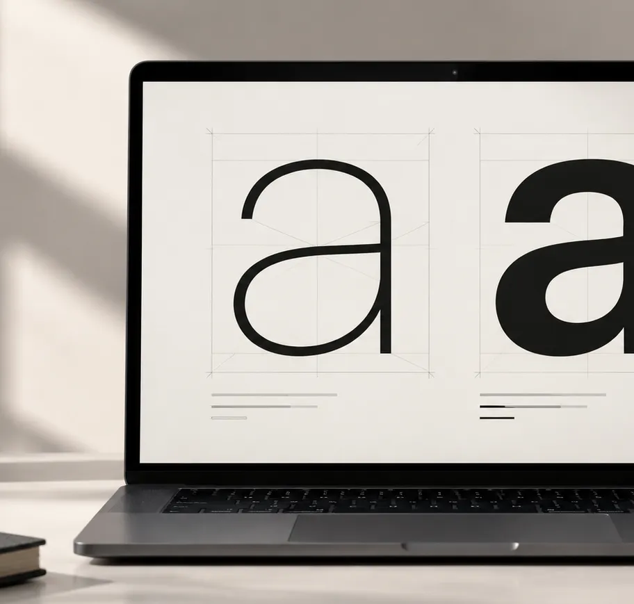
In practice, one family and two weights can cover an enormous amount of real-world branding work. A simple system might be:
Regular
Used for body copy, descriptions, captions, supporting information, long-form reading, secondary navigation, and metadata.
Semibold or Bold
Used for headlines, section titles, buttons, labels, navigation, key information, and calls to action.
Size
Instead of introducing a third weight to create another level of hierarchy, change the size. A large Regular can become a headline. A small Bold can become a label. A medium Regular can become supporting information. A large Bold can become a statement.
The typeface hasn't changed. The weight hasn't necessarily changed. The hierarchy comes from the relationship between elements.
Hierarchy Without Adding Fonts
One of the biggest misconceptions in typography is that hierarchy requires multiple typefaces. It doesn't. Hierarchy is primarily about difference. If two pieces of information have exactly the same visual characteristics, they compete equally for attention. Change one or more characteristics and hierarchy appears.
- Scale — the simplest tool. A 48px heading and a 16px paragraph immediately establish hierarchy. No second font required.
- Weight — Regular versus Semibold can create a strong distinction without changing the typeface.
- Spacing — whitespace can be more powerful than another font. Increasing the space around a heading can make it feel more important without changing its size.
- Line-height — dense text feels different from open text. A generous line-height can make body copy feel editorial and calm; a tighter line-height can create a more compact, energetic block.
- Tracking — small adjustments to letter spacing can change the visual character of labels, navigation and large display text.
- Color — even within a monochrome system, black and gray can establish clear levels of importance.
- Position — where an element sits on the page can determine its perceived importance as much as its typeface.
The result is a much more flexible system than simply adding another font.
Where the Extra Fonts Actually Go
Trace most extra typefaces back to their origin and they usually protect exactly one moment — a single headline, a quote block, one campaign, one presentation slide, one social media graphic, one landing page. Then the font sits unused. Meanwhile, it has become part of the system.
That creates a subtle problem. Every additional typeface introduces another decision: which weight, which size, which pairing, which spacing, which context, which designer gets to use it, which version is approved. The system becomes harder to maintain.
Exceptions multiply
A five-font system rarely stays a five-font system. It tends to become "We normally use Font A, but for this campaign..." Then "For this type of headline, use Font B." Then "This quote looks better in Font C." Then someone creates a new presentation using Font D.
Eventually, the brand guidelines describe a system that nobody actually follows. This is how visual inconsistency happens — not through one bad decision, but through hundreds of tiny exceptions.
Typography as a Design System
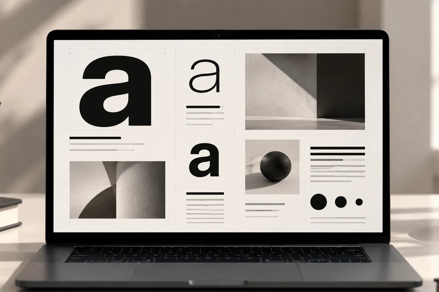
A strong typographic system should not simply tell designers which fonts to use. It should reduce the number of decisions they have to make. Imagine a small design system with one family, two weights, five sizes, three spacing levels, and two text colors. That's already enough to create dozens of combinations. The important thing is that those combinations still belong to the same visual language.
Example system
- Display — Primary family, Bold, 64–80px
- H1 — Primary family, Bold, 48–56px
- H2 — Primary family, Bold, 32–40px
- Body — Primary family, Regular, 16–18px
- Caption — Primary family, Regular, 12–14px
- Label — Primary family, Bold, 11–13px
The exact numbers aren't sacred. The principle is. Define a system before you define exceptions.
The Operational Cost of Too Many Fonts
The cost of typography isn't only aesthetic. It is operational. Every font introduces another asset into the system. On a website, that can mean additional font files. On a brand project, it can mean additional licensing. Inside a company, it can mean additional documentation. For designers, it means additional decisions. For developers, it can mean additional implementation and testing. For marketing teams, it can mean more opportunities for inconsistency.
Performance matters
Web fonts aren't free. Font files have to be loaded. Different weights can mean additional files. Different families can mean even more files. A brand that loads five families with multiple weights can create unnecessary complexity when a carefully selected family with two weights might have been enough. The difference isn't always dramatic, but design systems are built from repeated decisions — small inefficiencies compound.
Licensing matters too
Every additional font can introduce questions: is it licensed for commercial use? Is web usage included? Can the marketing team use it? Can external agencies use it? Can it be embedded in an application? Does the license cover future products? A restrained system reduces these questions. The simplest design decision can sometimes be the simplest operational decision too.
Building It in Practice
If a brand already has a font drawer, the fix isn't necessarily a full rebrand. Start with an audit.
Step 01 — Audit what is actually being used
Don't begin with the brand guidelines document. Begin with reality. Look at the last year of websites, presentations, social posts, advertisements, brochures, proposals, packaging, emails, documents, and campaign assets. Make a list of every typeface that actually appears. You may discover that five fonts exist in the guidelines but only two are consistently being used. That's useful information.
Step 02 — Find the strongest existing family
Look for the typeface that already appears most frequently. Then evaluate it. Does it have a strong Regular weight? A useful Semibold or Bold? Good readability? Sufficient character coverage? Useful numerals? Good screen performance? Appropriate licensing? Enough personality for the brand? If the answer is yes, you may already have your solution.
Step 03 — Keep two core weights
Choose a simple pair — Regular + Semibold, or Regular + Bold. Don't automatically select Light, Medium, ExtraBold, Black and all the other available weights just because the family provides them. Availability doesn't mean necessity. A design system is stronger when every weight has a job.
Step 04 — Rebuild hierarchy
Before adding another font, experiment with size, spacing, weight, color, alignment, and whitespace. These variables can create significantly more variation than most designers expect.
Step 05 — Test the system across real applications
Don't test the system only on a beautiful presentation board. Put it into real situations — a homepage, an article, a pricing section, a presentation slide, a social media post, a business card, an advertisement, a long-form document. If the system survives all of these, it is probably strong. If it breaks in one specific situation, identify exactly why. Then solve that problem. Don't immediately add another font.
When One Font Isn't Enough
There are legitimate reasons to use more than one typeface. Restraint doesn't mean an absolute rule that every brand must use one family. Some identities genuinely benefit from contrast. For example:
- Editorial brands — a serif and sans-serif combination can create a strong relationship between long-form reading and modern interface elements.
- Cultural brands — a secondary typeface may be necessary to support a particular cultural or historical character.
- Multilingual systems — different scripts may require different type families because one family may not provide an appropriate or well-designed companion for every writing system.
- Highly expressive brands — fashion, entertainment, music and experimental brands may intentionally use typography as a primary expressive device.
The question isn't "Can I use another font?" Of course you can. The better question is: "Does the additional font solve a problem that the existing system genuinely cannot solve?" If the answer is no, leave it out.
The Difference Between Constraint and Limitation
This distinction matters. A limitation is something that prevents you from doing something. A constraint is something you intentionally choose not to do. The difference is psychological.
If a client says "You can only use one font," it may feel restrictive. But if the design team says "We're going to build the entire identity around one family and two weights," that becomes a creative challenge.
Now the designer has to ask better questions. How can scale create drama? How can whitespace create elegance? How can weight create hierarchy? How can layout create personality? How can color create emphasis? How can repetition create recognition? The constraint doesn't reduce creativity. It redirects it.
The Final Rule
Typography doesn't need to be complicated to feel sophisticated. In many cases, the opposite is true. A carefully selected typeface, used consistently, can create more character than a collection of unrelated fonts.
One family gives you consistency. Two weights give you hierarchy. Size gives you scale. Spacing gives you rhythm. Color gives you emphasis. Layout gives you personality. And restraint gives all of those decisions room to work.
The goal isn't to use the fewest fonts possible. The goal is to use exactly as many as the system needs — and not one more. Because most of what a fifth font was trying to fix, the first three design decisions already solve.
One font. Two weights. Zero excuses.
What do you think?
Share your thoughts. Your email address will not be published.